things you’d queue up for
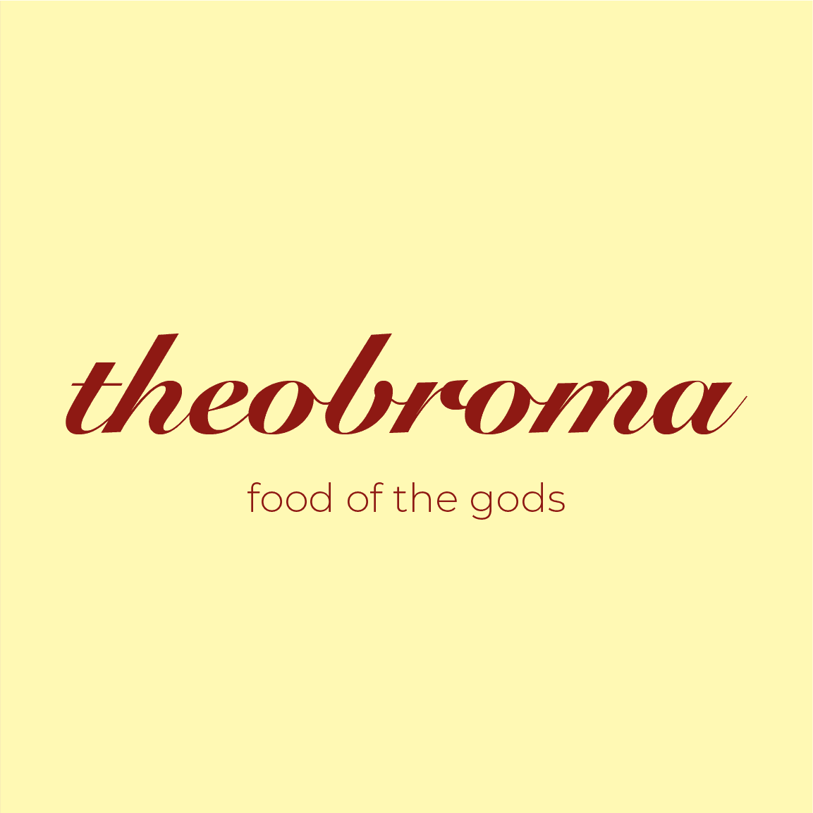
Pastel ice cream packaging design with retro typography on pink background

project overview

rebranding theobroma meant balancing its familiar, indulgent “treat yourself” feel with a more contemporary identity. the project revealed how layered restaurant branding is beyond logos, it’s packaging, menus, tone of voice, and small moments that matter. it taught me how to refresh a beloved brand without losing its heart.

Hand holding waffle cone with three scoops of colorful pastel ice cream
Close-up of hand holding pink ice cream cone against pastel background
Macro shot of pink ice cream texture with creamy details

Create a free website with Framer, the website builder loved by startups, designers and agencies.