things that go pop
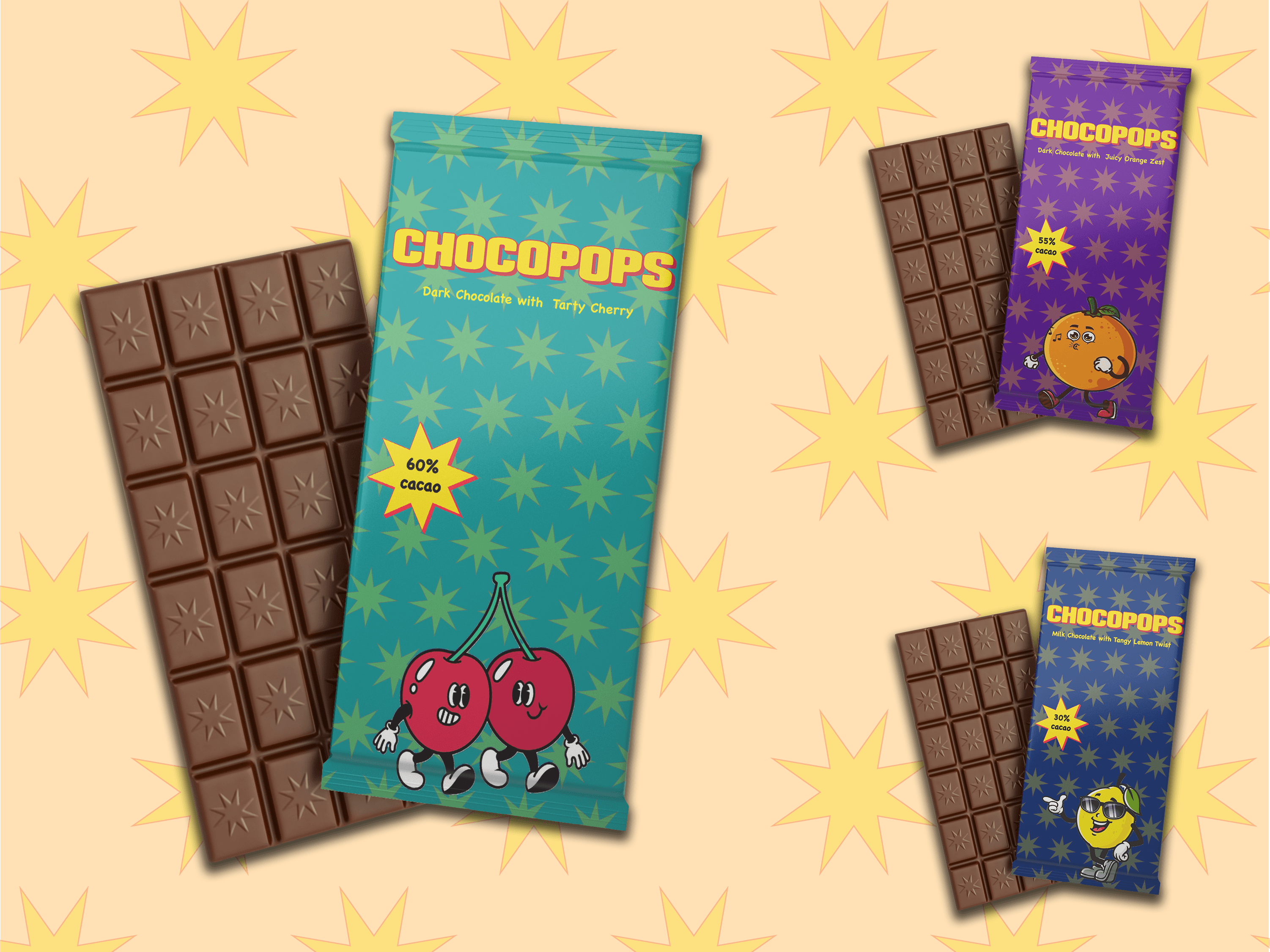
project overview
designing this chocolate brand was me trying to bottle joy and discovering it’s trickier than it looks. the challenge was making flavours and visuals feel exciting without being obvious. with the pop-rocks twist, finding the balance between fun, bold, and premium took time. i learned how colour, shape, and tiny graphic choices influence taste perception, as well as packaging structure and shelf appeal.